
In case anyone is curious about the illustration in my banner- it's from this variant fanart of the yugioh monster "slifer the sky dragon"
+slifer the sky dragon by =slifertheskydragon on deviantART
I felt like i need to talk about it because of how I chose a predominant red theme. My favorite color is red, i'm not too sure why but I think it's the aesthetics of the color- red's association with romance, love, anger, rage, etc. Red is I think, the only color able to achieve such a broad range of emotions. This journal has a red-black theme because I felt it matched better than the dark red-black banner with a white background. Plus, i'm not one for bright screens...
the original design of the dragon can be seen (also drawn by me):
- Slifer the Sky Dragon - by =slifertheskydragon on deviantART
notice how the dragon itself has primary colors (blue: orb,tongue Yellow: eyes (it uses thunder-based attacks, so those are yellow) Red: skin, etc) and coincidentally if you take what i've talked about in the superman-action heroes and colors post, the monster is the main character's key card. In fact, aside from the first time it was introduced, only the main character has used this monster. It seems the strength in the use of the primary triad lies with the overall unity that the colors create, but also accenting a predominant primary (i.e. red in this case) with the other primaries achieves a similar effect.
The use of black/white (sharp contrast) also compliments the contrast given by the primary colors to create more accentuation and brings attention to the "belly" of the dragon with the black/white. The primary colors help to bring attention to the dragon's face.
This dragon shows the use of color to bring attention to key areas- a good idea to keep in mind when thinking about what colors to make your newest creation.
Saturday, November 21, 2009

Thursday, November 19, 2009
Nathan Shedroff's "Experience Design" - sustainability
"While everything, technically, is an experience of some sort, there is something important and special to many experiences that make them worth discussing. In particular, the elements that contribute to superior experiences are knowable and reproducible, which make them designable." - Nathan Sherdoff
From the guest lecture at UC Davis' design dept. on Wednesday, I was able to take some key ideas and thoughts. I copied down two of his illustrated points- that of what makes up "experience design" and what three keys lie in good design for the future:

The first Venn diagram shows just what experience design is made up of- the combination of design/engineering with sustainability in mind and coupled with business leads to a successful product with these three aspects in mind for the consumer.
"Don't design things today that make tomorrow worse." - Nathan Shedroff
Consumerism is such a huge aspect in society today that the very foundation of our economy is based upon it. Our landfills are piling up with products that while pretty well designed for its use was, in the end, unable to be sustainable and recycled properly. The fact is there is no such thing as "sustainable design" simply because the products we make today do not last forever in the eye of the consumer. Products break down and new versions are made. This is what drives consumers to buy the new and the trendy, but in hindsight they fail to see that they're just creating more garbage with their older products. Thus to create "sustainable" products, you must place a sentimental value within them. The best example is a child's "blankey"- an object that the child will keep for as long as possible (much to the parent's dismay when the child is "too old" for such a thing) because of the emotional and sentimental value of the object. The child feels "safe" with the object, and thus keeps it for as long as possible.
By placing a sentimental value on an object, that object gains a somewhat sustainable factor in being used and kept for a long time, and doesn't end up in the landfill quite so quickly.
for more about Nathan and his books, visit http://nathan.com/ed/index.html
From the guest lecture at UC Davis' design dept. on Wednesday, I was able to take some key ideas and thoughts. I copied down two of his illustrated points- that of what makes up "experience design" and what three keys lie in good design for the future:

The first Venn diagram shows just what experience design is made up of- the combination of design/engineering with sustainability in mind and coupled with business leads to a successful product with these three aspects in mind for the consumer.
"Don't design things today that make tomorrow worse." - Nathan Shedroff
Consumerism is such a huge aspect in society today that the very foundation of our economy is based upon it. Our landfills are piling up with products that while pretty well designed for its use was, in the end, unable to be sustainable and recycled properly. The fact is there is no such thing as "sustainable design" simply because the products we make today do not last forever in the eye of the consumer. Products break down and new versions are made. This is what drives consumers to buy the new and the trendy, but in hindsight they fail to see that they're just creating more garbage with their older products. Thus to create "sustainable" products, you must place a sentimental value within them. The best example is a child's "blankey"- an object that the child will keep for as long as possible (much to the parent's dismay when the child is "too old" for such a thing) because of the emotional and sentimental value of the object. The child feels "safe" with the object, and thus keeps it for as long as possible.
By placing a sentimental value on an object, that object gains a somewhat sustainable factor in being used and kept for a long time, and doesn't end up in the landfill quite so quickly.
for more about Nathan and his books, visit http://nathan.com/ed/index.html
Monday, November 16, 2009
Objectified

Huswit's film, "Objectified" shows the relation between form and content by showing us the world of industrial design. The goal of industrial design was to create forms that were able to become mass-produced, and widely available to the public. Made most famous by Ford and his assembly line, Ford tells us that "every object tells a story if you know how to read it."
In the beginning, we think of "form" as directly related to "function". This is best illustrated as if you were an alien to our planet Earth. When you pick up a spoon, the design tells us a general idea of what to and what not to do with it. But as design evolved, the form no longer had such a bold and direct relation with function/content. The best example shown in the film is the iPod/iPhone devices where you wouldn't be able to associate all the applications to the simple rectangular shape/form.
As designers we must look to the future- one where since form and function no longer have a distinct relation to one another we have to look at the form applying to human interaction with the object. Only in this way does form and the content reintegrate together and work off one another as it did when function was a part of the very idea of looking at a spoon.
for more information on the film, please visit http://www.objectifiedfilm.com/
Thursday, November 12, 2009
Primary vs Secondary colors in comics
In general, primary colors are reserved for heroes, because they are colors that are basis of all other colors aside from the primaries in the color wheel. They are gestalt within themselves, the "perfect form" of a color. When we see all three together, we also get a sense of unity and our minds are at ease. In the comic book world, the best example?
Superman by ~DocShaner on deviantART
Superman. His costume is nothing but the primary colors. Such bright primary colors that aren't off tone give you the sense that "this guy is the hero and seems like a nice person" especially when combined with his facial expression, he has a "boy scout appearance" There is a sense of unity and harmony in the use of the primary colors, and our eye likes it.
Contrast this to a character whose wardrobe is based on secondary colors (and his face clashes)-
Joker by ~luli44 on deviantART
The Joker. His wardrobe is an off-green and purple, two secondary colors, and purple, if placed on a monochromatic scale, is a "dark" color, green is "neutral" but because of its contrast with the Joker's red smile, such contrast, like Christmas colors create discord for our eyes. His manic sickly yellow (note how i associated "sickly" with yellow) and pale white face show us this person isn't healthy, and the fact that he carries a gun makes him an immediate "villain" archetype.
The use of predominant primary colors in comics is generally reserved for heroes, a short list-
DC: Superman, Old school Batman (he was blue/yellow), wonder woman (primary), the Flash (red/yellow), Static Shock (blue/yellow)
Marvel: Spiderman (red/blue), Wolverine (yellow/blue), Cyclops (yellow/blue)
Japanese comics: Yugioh (red/yellow hair, blue clothes), Ash Ketchum + Pikachu (red hat, blue clothes, yellow pet)
The use of predominant secondary colors in comics is generally reserved for villains, though these colors are usually off-color, resulting in a pale or "washed out" color scheme-
DC: the Joker, Lex Luthor (purple/green)
Marvel: Magneto (magenta/purple)
From the above list we can see that such use of the primary and secondary colors helps divide the "good and evil" characters apart, and makes it a "standard" so that we can almost immediately categorize characters by color alone.
Superman by ~DocShaner on deviantART
Superman. His costume is nothing but the primary colors. Such bright primary colors that aren't off tone give you the sense that "this guy is the hero and seems like a nice person" especially when combined with his facial expression, he has a "boy scout appearance" There is a sense of unity and harmony in the use of the primary colors, and our eye likes it.
Contrast this to a character whose wardrobe is based on secondary colors (and his face clashes)-
Joker by ~luli44 on deviantART
The Joker. His wardrobe is an off-green and purple, two secondary colors, and purple, if placed on a monochromatic scale, is a "dark" color, green is "neutral" but because of its contrast with the Joker's red smile, such contrast, like Christmas colors create discord for our eyes. His manic sickly yellow (note how i associated "sickly" with yellow) and pale white face show us this person isn't healthy, and the fact that he carries a gun makes him an immediate "villain" archetype.
The use of predominant primary colors in comics is generally reserved for heroes, a short list-
DC: Superman, Old school Batman (he was blue/yellow), wonder woman (primary), the Flash (red/yellow), Static Shock (blue/yellow)
Marvel: Spiderman (red/blue), Wolverine (yellow/blue), Cyclops (yellow/blue)
Japanese comics: Yugioh (red/yellow hair, blue clothes), Ash Ketchum + Pikachu (red hat, blue clothes, yellow pet)
The use of predominant secondary colors in comics is generally reserved for villains, though these colors are usually off-color, resulting in a pale or "washed out" color scheme-
DC: the Joker, Lex Luthor (purple/green)
Marvel: Magneto (magenta/purple)
From the above list we can see that such use of the primary and secondary colors helps divide the "good and evil" characters apart, and makes it a "standard" so that we can almost immediately categorize characters by color alone.
Your color, choose a side
When you see the color red, what do you think of?
Love? Roses? Blood?
What about blue?
Sadness? Blue? Water?
Why do we associate colors with emotions or objects immediately?
Our minds try to find reason, truth, and when it does it feels good, content.
We use such associations for colors in design to convey emotions, or perhaps trigger memories of a place, person, or thing. This is a psychological compensation called "color constancy" where we think that grass must be green and the sky must be blue.
In the comic book world, colors are used to help "determine your side"- Hero or Villain.
An excellent use of the color spectrum, combined with facial expressions can be seen in DC's "Green Lantern" series:
BlackestNight: Tales by `Bakanekonei on deviantART
In this case, the colors of the person (and subsequent corps) reflect an emotion:
"In DC Comics, the emotional spectrum is divided into the seven colors of the rainbow, with each color corresponding to a different emotion:
rage (red),
avarice (orange),
fear (yellow),
willpower (green),
hope (blue),
compassion (indigo),
and love (violet)." (http://en.wikipedia.org/wiki/Emotional_spectrum)
The "warm" colors are considered the villains and the "cool" colors are "heroes". Green is the "middle ground" though in general is a "hero" group.
Why is this?
I think it is because warm colors have a kind of "life" in them, they excite our eye, give off a kind of "energy", where as "cool" colors try to calm us, they "bring us down" instead of "excite" us. In this sense, the colors tied with their respective emotion is based on this, and our already conceived view of that color. Though yellow if we think about it, usually represents happiness, or the sun, but in WWI, it represented fear and death (the mustard "yellow" gas) and also represents sickness (decay, like in rotting teeth). It is in this context that we must be careful to choose our colors wisely, and use them alongside the context from where they are placed to communicate through design properly.
Love? Roses? Blood?
What about blue?
Sadness? Blue? Water?
Why do we associate colors with emotions or objects immediately?
Our minds try to find reason, truth, and when it does it feels good, content.
We use such associations for colors in design to convey emotions, or perhaps trigger memories of a place, person, or thing. This is a psychological compensation called "color constancy" where we think that grass must be green and the sky must be blue.
In the comic book world, colors are used to help "determine your side"- Hero or Villain.
An excellent use of the color spectrum, combined with facial expressions can be seen in DC's "Green Lantern" series:
BlackestNight: Tales by `Bakanekonei on deviantART
In this case, the colors of the person (and subsequent corps) reflect an emotion:
"In DC Comics, the emotional spectrum is divided into the seven colors of the rainbow, with each color corresponding to a different emotion:
rage (red),
avarice (orange),
fear (yellow),
willpower (green),
hope (blue),
compassion (indigo),
and love (violet)." (http://en.wikipedia.org/wiki/Emotional_spectrum)
The "warm" colors are considered the villains and the "cool" colors are "heroes". Green is the "middle ground" though in general is a "hero" group.
Why is this?
I think it is because warm colors have a kind of "life" in them, they excite our eye, give off a kind of "energy", where as "cool" colors try to calm us, they "bring us down" instead of "excite" us. In this sense, the colors tied with their respective emotion is based on this, and our already conceived view of that color. Though yellow if we think about it, usually represents happiness, or the sun, but in WWI, it represented fear and death (the mustard "yellow" gas) and also represents sickness (decay, like in rotting teeth). It is in this context that we must be careful to choose our colors wisely, and use them alongside the context from where they are placed to communicate through design properly.
Sunday, November 8, 2009
You know when you've watched too much anime when...
You actually recognize what this

is.
If you've never watched a single anime (short for Japanese Animation) you probably wouldn't understand or know what the heck the above picture is supposed to represent or be nonetheless.
You are supposed to recognize the colors above as the main robot from the anime series "Evangelion" :
 (c) Gainax
That was actually the first one I had recognized off the bat, there's a great deal of others that took me a while to distinguish because of the colors. Much like how we recognize characters like Mickey Mouse ( ) by the distinctive "H2O" molecule silhouette, anime fans on a Japanese message board came to together to create over 50 of these "color mind tricks" to test your obsession with certain popular anime series. It's not only the colors but the very spacing of the colors that made anime fans associate the first image with Evangelion, because purple is the primary predominant color, while there is only hints of green.
This ties down to the basis of color theory, in which by use of certain colors the audience will immediate associate an idea or in this case, anime series/character with the use of colors. A western equivalent would be red and blue (with hints of yellow) as representative of DC comic's Superman or black (blue) and yellow representative of DC comic's Batman. In the western case, they used primary colors to distinguish their "hero" character from villains who have off-primary colors, such as DC comic's Joker, who is distinguished by purple and green.
Creators do this so we associate color schemes and patterns with characters and also to in a way show their "sides" of either villain or hero. Such a strong presence of color scheme creating such an imprint is representative of the gestalt, in which our minds find unity in being able to successfully associate the picture with the idea.
You can find more of these "mind tricks of obsession" over at http://en.gigazine.net/index.php?/news/comments/20091102_otaku_proof

is.
If you've never watched a single anime (short for Japanese Animation) you probably wouldn't understand or know what the heck the above picture is supposed to represent or be nonetheless.
You are supposed to recognize the colors above as the main robot from the anime series "Evangelion" :
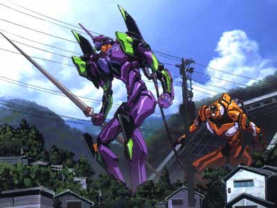 (c) Gainax
That was actually the first one I had recognized off the bat, there's a great deal of others that took me a while to distinguish because of the colors. Much like how we recognize characters like Mickey Mouse (
 ) by the distinctive "H2O" molecule silhouette, anime fans on a Japanese message board came to together to create over 50 of these "color mind tricks" to test your obsession with certain popular anime series. It's not only the colors but the very spacing of the colors that made anime fans associate the first image with Evangelion, because purple is the primary predominant color, while there is only hints of green.
This ties down to the basis of color theory, in which by use of certain colors the audience will immediate associate an idea or in this case, anime series/character with the use of colors. A western equivalent would be red and blue (with hints of yellow) as representative of DC comic's Superman or black (blue) and yellow representative of DC comic's Batman. In the western case, they used primary colors to distinguish their "hero" character from villains who have off-primary colors, such as DC comic's Joker, who is distinguished by purple and green.
Creators do this so we associate color schemes and patterns with characters and also to in a way show their "sides" of either villain or hero. Such a strong presence of color scheme creating such an imprint is representative of the gestalt, in which our minds find unity in being able to successfully associate the picture with the idea.
You can find more of these "mind tricks of obsession" over at http://en.gigazine.net/index.php?/news/comments/20091102_otaku_proof
Sunday, November 1, 2009
Alternative Press Expo

Myself with Joanne Matte (http://rufftoon.deviantart.com/)
I meant to post this earlier to when the event ended, but due to other scholastic-related commitments have been unable to do so... until now.
The Alternative Press Expo (APE) is a comics convention for self-publishers, independent publishers and alternative cartoonists to showcase their art and works. The recent event, held in the Concourse in San Francisco showcased about 100+ independent comic artists and publishers to showcase alternative comic and artwork. In today's art and design world, getting your name and work out there is key. Venues such as APE allow for artists to put themselves out on the market, without having to compete against the big corporate faces such as DC comics or big-time established names to show their work and hopefully get their work out to generate interest to become "viral". Viral networking isn't limited to just the computer, it is a tool to help us get out there in real life, and with the help of events such as APE, artists are allowed to "viral" their works, free pamphlets, selling printed material, etc, these are the venues to spreading your work outside of the internet.
I was fortunate to meet Mrs. Matte, whom outside of her professional job as an animator/storyboard artist enjoys her time creating fan comics as well as self-publish her own original stories and ideas to share with fans and enthusiasts alike. When I asked her what it took to become successful in such a field, she said it was to "never give up, and if one company doesn't like the idea, refine it and take it to another" and to keep going, but if it all fails, then take time and rework it, or come up with something even better. It's this "trial and error" process that I mentioned in the "designerific method" idea in my last entry that I think is the key to success in any field.
APE is an excellent venue to go to check out alternative comics and get opinions and critique from other artists, many of which are veterans/seniors in the field and can provide excellent feedback.
for more information, visit their website at http://www.comic-con.org/ape/
Subscribe to:
Posts (Atom)
